Holistic condition history
My Role
Lead experience designer (UX/UI) + User testing
Collaborators
Medical director, Data science team + Product manager
Problem
Journi displayed someone’s health history as one long chronological list of events. User feedback revealed a desire to view details grouped by a condition or specific health event. It was cumbersome to recall details related to a specific health concern, and impossible to quickly view the "full picture" to answer simple questions like how long they'd been dealing with a specific condition/health event.
Desired Outcomes
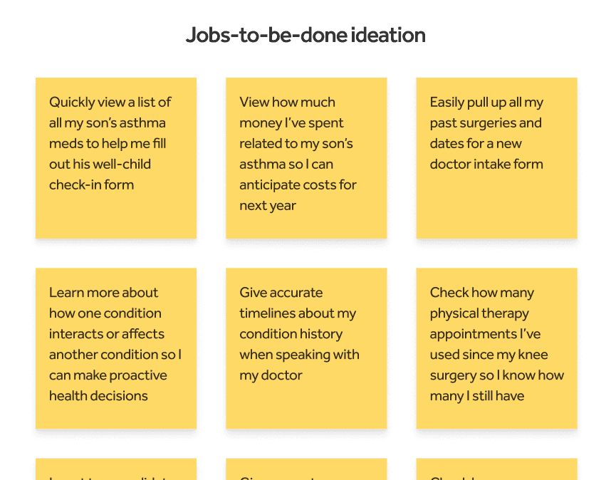
Create a holistic condition-specific view that helps reduce the cognitive burden of recalling health history, and enable more productive patient-doctor appointments.
Key types of users to design for were those managing their own chronic conditions; and caregivers helping a loved one manage.
Understanding the data
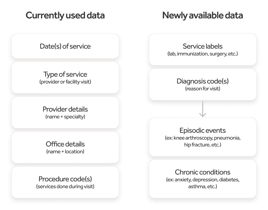
Someone's health history was retrieved through insurance claims data, then run through data models to clean up the data before sending it to the app to present. (I worked with the data science team on the initial app design of presenting health data.) Initially, some claims data couldn't be cleaned up in a meaningful way to present back to users so it was withheld until proper data models could be created to clean up the data.
New data was now available. To kick off the project, I worked with the data science and clinical teams to understand the new types of available data to present to users, in order to begin design iterations.
Design concepts + User interviews
I created rough concepts for feedback then co-led sessions with 7 existing users of the app, including caregivers and self-managed users to get a better understanding of these key things:
Which conditions/episodic events are people interested in tracking, or not?
What information about those conditions/episodes do people want to view?
Where could this live and what naming conventions resonate?
Implementing Learnings
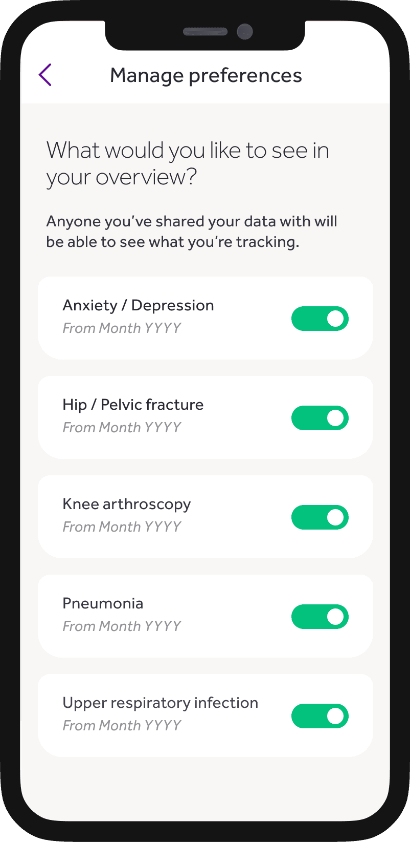
Give users control to show or hide what they want and when.
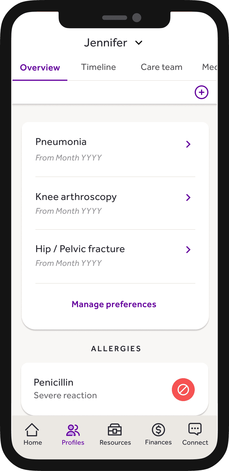
Just because we had the data, didn’t mean users wanted to see it. Sensitive conditions like anxiety and depression weren't desirable to see upfront so users were prompted to "get started" which enabled an initial preferences view for control to hide anything they didn't want to see.
Don't over design it.
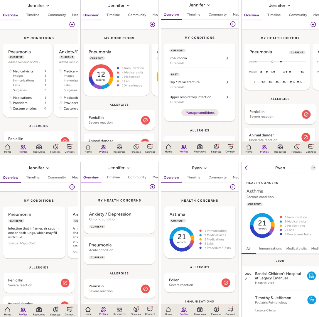
Using data visualization was well received in user testing because of how it "looked" but didn't make sense in how it functioned. Since records overlapped, a pie chart wasn't an accurate way to present the data. Opted for a more simple UI with iconography consistent to other areas of the app for easy recognition and distinction.
Set us up for future success. Allow user to manually add information, but in a way that could enable future capabilities instead of limit them.
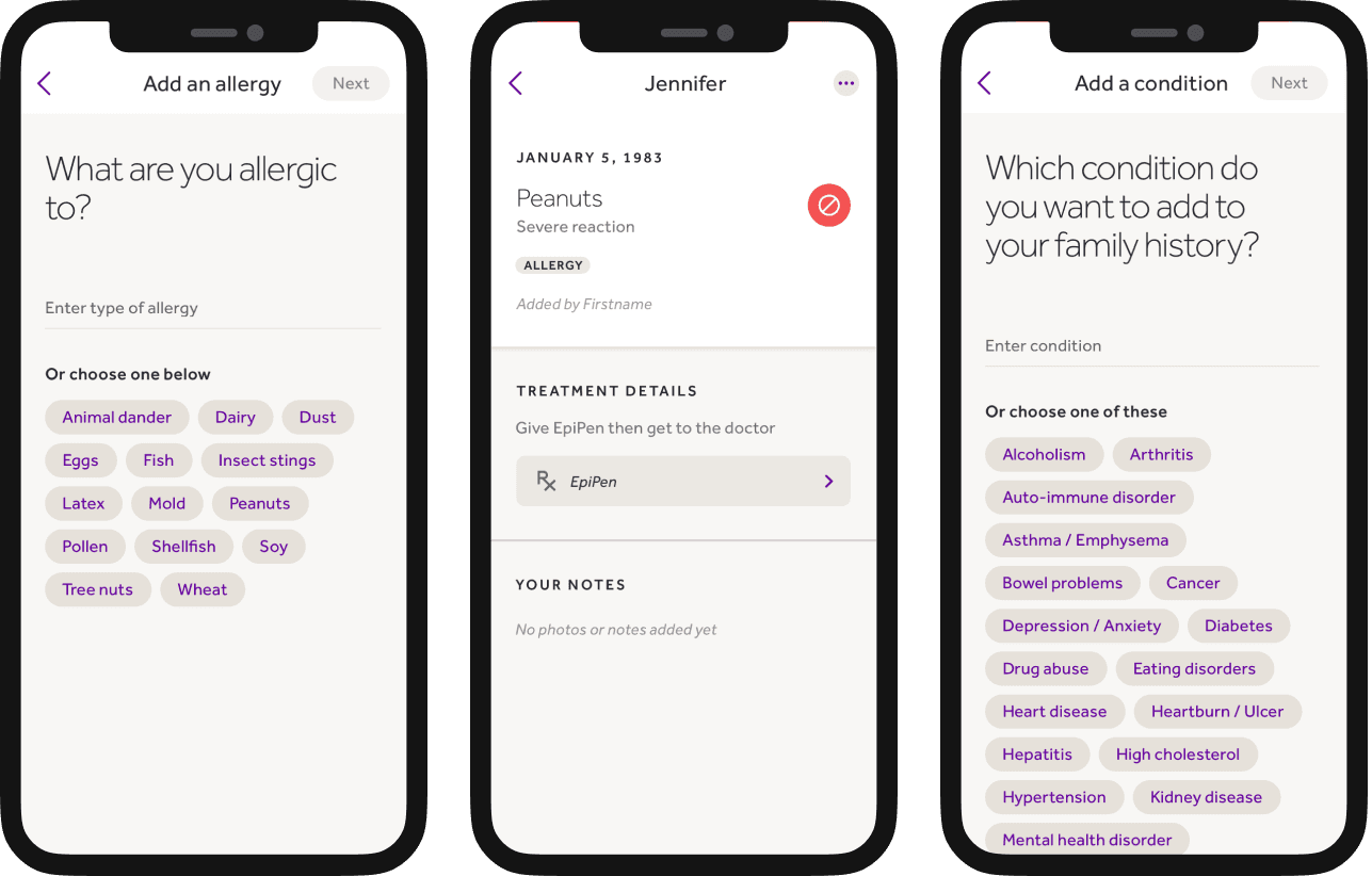
Identified information similar to a new patient intake form that people could manually add to round out their health history. Included adding a person's allergies, surgeries and family history. Also created a centralized view of a user's immunization history.
Although we couldn't automatically get certain things from the data, I designed flows that allowed us to integrate into other areas of the app with the help of the user.
Implemented defined data sets that would enable future capabilities like providing insights based on known data and reduced user error of misspellings or incorrect terminology.
Allowed users to tag timeline events, doctors and prescriptions related to an episode or condition, with ability to filter by those tags.
Enabled users to link a medication to take in case of allergy exposure by allowing them to select from existing list of their prescriptions.
Results
Before these new features were launched, I took a job with another company and do not have engagement metrics to share. Though, during that time, plans were underway for Journi to merge with Regence BlueCross/BlueShield and Asuris (health insurance brands owned by Journi's parent company, Cambia). The Journi app experience replaced the Regence/Asuris member apps. In early 2022, Journi was rolled out to 3M+ health plan members as the new branded experiences for Regence and Asuris.
As Journi's first designer, this is just a small example of my work during 4 years with the company. I was part of everything from initial user research to private beta and Minimum Lovable Product experience launches.
